Sponsored by Oldspeake
This post was published by our friends at Oldspeake. Oldspeake is a web and app development studio that creates digital experiences worthy of the human experience. Their design-centered development team specializes in animation and motion graphics, mobile/ responsive design, and building blazing-fast, high-performing technology for the modern web.
Is your creative firm’s website sending the right message to your potential clients?
Google recommends that websites load the most meaningful content in less than two seconds. They reported that 53% of page visits are abandoned if pages take longer than 3 seconds to load.
The average agency website takes about 3 seconds, which means that half of them are even slower than that.
If you’re unsure where you rank, there’s a good chance you’re leaving money on the table.
Why should performance matter to your agency?
Your website is likely one of the primary drivers of your content marketing strategy. It’s also probably the primary channel for people you don’t know to make first contact with your firm. And unlike most platforms, you own this one.
Over the years, Google and other search engines have started to heavily consider user experience factors in their search algorithms. What started as cross-browser consistency and mobile-friendliness has also grown to include—wait for it—page speed.
This means your content doesn’t need to just be good to be successful. It has to feel good. Anything less and you’re losing traffic, wasting your content marketing efforts. Your next ‘perfect client’ might be finding their way to a faster competitor instead. As you know, buying is a highly emotional activity. It’s based on how we feel.
If this scenario isn’t enough to pique your curiosity, consider this:
A recent study of 1500 agency websites found a correlation between how much an agency charges and the speed of their homepage. Faster websites with quality content build more trust and convert more buyers. It’s a simple and consistent paradigm.
And if these things are true for your agency’s website, they must be just as true for your clients’ websites, too.
Web performance is more than just total load time.
Some of the fastest websites you visit still take around 4 seconds to fully load. If the recommendation is less than 2 seconds, how can that be?
I won’t bore you with too many technical details, but there are some terms I think will help understanding performance moving forward:
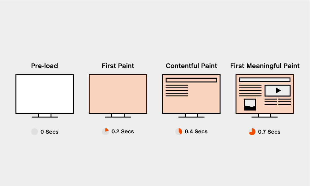
- Time-to-first-byte (aka TTFB) is the time it takes a web server to respond to a URL request
- First paint is the time when the first pixel is painted onto the screen, like a background color.
- First contentful paint is the time when the first piece of content can be seen.
- First meaningful paint is the time when the content the user cares about finally loads.
- Time-to-interactive (commonly referred to as TTI) is the time it takes for a website to be usable. For instance, it’s quite common that content will load before interactive elements that might lean on JavaScript to work, like buttons, menus, etc.
The fastest websites you visit have a fast first meaningful paint, and maybe even a fast time-to-interactive. These likely occur within the recommended 2 seconds. But some things may linger, like images and content outside the initial viewport and tracking scripts. Since those aren’t things your users care about (at least not yet), search engines are okay with it.
You may have noticed some apps you use achieve a fast first paint by offering up a “skeleton view” of the UI made up of simple shapes and colors. If you’ve noticed this, it’s probably because the first contentful paint took too long.
The most obvious example of poor performance is that blank white page. This is usually the result of a slow time-to-first-byte, something you can probably blame on the web server in your cousin’s basement.
Not all loading feels the same.
Your website visitors aren’t counting your load times. They’re *perceiving *****them. In fact, your website’s perceived performance is often more important than its actual performance metrics.
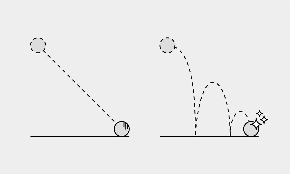
Imagine you and some friends are waiting to be seated at a busy restaurant (you know, when we could still go to restaurants). There are a few scenarios that come to mind:
- You’re in a crowded lobby, making desperate eye contact every time the host looks your way, hoping they don’t forget about you.
- You’re put into an automated workflow where they’ll text you updates on the status of your table, so you’re free to explore the area.
- There is room at the bar, so you and your mates can collude with some Moscow Mules.
It’s going to take 20 minutes to get your table, but I imagine you have a preference over which of these paths you take to get there.
This illustrates the difference between passive waiting and active waiting. Active waiting feels faster, even if it isn’t, because you’re engaged and entertained in the process.
Let’s be clear, nobody likes to wait. Whenever possible, we should be designing our sites to load in less than two seconds. Ideally, they’d feel nearly instantaneous.
But sometimes this is hard or impossible to manage for creativity-driven websites with tons of immersion and large graphic assets. In these scenarios, it’s important to exert some design control over the waiting experience so you don’t lose your visitors.
How to create active waiting experiences.
All of the space between time-to-first-byte and time-to-interactive is available for you to leverage creativity to give your user an active waiting experience, so use your imagination.
I have four good, high-level examples of the different approaches I’ve seen. They’re in no particular order, and each can be argued the most useful depending on your brand strategy.
Immediately Useful
French designer Robin Noguier recently released his beautiful new website. There is a lot going on from a technical perspective to make this website quick to load, but take notice of how he uses the space before time-to-interactive.
Immediately after the server response you can see his name and discipline, along with quick visual rundown of the projects in his portfolio. There’s even a quick snippet of text available to show some of his personality. Even if the interactivity is delayed from a slow connection, the reader will still be able to access the most useful information on the homepage.
Branding — Voice
Ueno is incredibly fast to respond, but there is still a small moment necessary for the initial video content to load. They take this opportunity to showcase an important element of their brand, their voice, to entertain the reader as they pass the time.
Randomly choosing between several clever phrases, Ueno shows off their sense of humor and culture. It doesn’t take long, and they could have left this space blank without losing too many viewers. By targeting these early milliseconds, they were able to create something that feels not only smooth, but personal.
Branding — Positioning
Everest also responds very quickly, but the level of interactivity in the main part of their viewing experience needs a bit more time to load. In that space, they’ve decided to smoothly fade in a quick message about their firm’s positioning in the market, letting the reader in on some valuable context to what they’re about to see.
They also included a helpful hint for how to interact with the next screen since they’re using experimental interaction design, tying directly into their positioning. Before you know it, the portfolio screen animates into view in 3D. Can we just stop and appreciate for a moment how beautiful this site is?
Branding — Visual Identity
Last, but not least, we have Dog Studio (sound warning). The main part of their website features a detailed 3D view of a cute pupper that changes as you scroll and interact with the site. This takes quite a bit to load, but since their server is fast, they can jump in quickly and try to keep you entertained while you wait.
Their technique of choice is to display a creatively branded loading element to help reinforce the visual identity of their brand. While you wait for all of the 3D assets and scripts to load, they show you a 2D animation of a dog running. Dog Studio. You’ll probably remember their name (or at least enough of it to search for it), especially if you like any of their work.
Let’s talk about jank.
‘Janky’ describes things that are of poor quality or unreliable. The amount jankiness on your website is a major factor in its perceived performance. Users can perceive your janky website even if they don’t know how to call it out directly.
You can put tons of energy into making your website load quickly—or at least appear to—and still end up with a website that feels poorly made. Given that your website is likely your most powerful brand touchpoint, it makes sense to focus on the details with at least the same rigor that you would with your other brand collateral.
There are many cues people are taking from your website to form unconscious opinions about your brand well after your website seems to have loaded.
Your page stutters during animations or scrolling.
Some animation techniques are more “expensive” than others, meaning that it takes more resources from your reader’s computer to render each frame. Most contemporary devices are capable of rendering 60 frames per second (fps). Although there is some debate on the upper limit, many scientists believe that the human brain can only process between 30-60 fps.
When too many expensive animations are happening at once, the calculations necessary for a browser to render the animations can sometimes cause frames to drop. Once you start hitting 30 fps or below, your readers will notice it. To make things worse, the dropped frames are generally sporadic, making it even more noticeable.
There are technical workarounds to many of these pitfalls, many of which rely on clever hardware acceleration techniques. Find a good partner for that. Otherwise, you can avoid choppy-feeling pages by keeping your animations focused, relatively simple, and with plenty of breathing room in the timings.
Your images are late to the party.
Perhaps the most obvious and jarring jank there is happens while waiting for images to load.
How many times have you been scrolling through an article on your phone when the paragraph you’re reading suddenly jumps offscreen to make room for a slow-loading image that you’ve already scrolled past? Often this can happen more than a few times on the same page.
Now how often have you been ready to click or tap a link when the same thing happens, causing you to accidentally click on the wrong link? Or worse, an ad?
Fix this jank by making sure your images have equally-sized placeholders to save their parking spot for them.
Your animations are lifeless.
In their pursuit of creating “The Illusion of Life“, Disney’s early animators introduced 12 principles of animation. These principles focused on producing the illusion that animated characters adhered to basic laws of physics, communicated emotions through timing, and had repeat value through a phenomenon they called ‘appeal’.
Many of these principles are still very relevant in motion design for user interfaces today.
Nothing sucks the life out of your website faster than rigid, linear animations. This is the place to let the soul and personality of your brand shine through. If WALL-E taught us nothing else, it’s that all emotions can be conveyed through animation alone. Yes, even for robots.
You’re not responding to the user quickly enough.
So far we’ve been talking about the experience of loading and viewing a single page, but the journey we’ve planned for our readers probably has multiple steps and seeks some sort of action.
There are two common areas where a fully-loaded page with great animations can still disappoint in perceived performance: navigation and form submission.
Creating an active waiting experience worked for loading your homepage. It might work for loading the next page, too, but you’d probably be pushing your luck. You’re better off investing in a worthwhile server with faster response times. There is also some neat technical sorcery available to try to anticipate reader intent and preload the next page, which is totally a worthwhile investment if you’re trying to create a seamless viewing experience by animating between pages.
Forms are often handled by third-party services, which are sometimes slow and out of our direct control. When this happens, don’t leave your user wondering what’s happening. This is yet another great time to use your creativity to design an active waiting experience while your form is being submitted. Using this opportunity to design a visual dialogue is a subtle but powerful message to the reader that your brand has their back and will make things easy for them.
Your newsletter pop-up is making everyone uncomfortable.
It’s possible to design pop-ups that don’t suck, but most people don’t. Pop-ups that are based on total time on a page are the ones that are generally the most disruptive.
You’ve finally loaded a page and you barely start scrolling when you’re rudely interrupted by someone you don’t know asking for direct access to your attention indefinitely. Or worse, you make it halfway down the page before the pop-up kicks in, and when you go to close it, it resets you back to the top of the page. You might win the conversion sometimes, but you’ll be turning people off way more often.
Instead wait to trigger your pop-up until you have good reason to believe that a reader is actually interested. Some decent times for this might be at the end of a long, engaging blog post that you know they actually read, if you know they’re a repeat reader, or if this isn’t the first page in their current session. And whatever you do, make sure that it’s easy to close and doesn’t make the reader lose their place in the article.
Your desktop bias is obvious.
It’s no secret that many designers haven’t gotten the mobile-first memo. Let’s face it, it’s often more fun to design on a bigger artboard anyway. But when you do that, you’re missing out on some of the key advantages to designing for small screens first. It forces you to focus on what’s most important to communicate. It’s also way easier to scale less stuff up than more stuff down.
Responsive web design may now be over 10 years old, but it’s still widely being treated as an afterthought—and your users can tell. 16:9 images abound, text sizes that don’t make sense, weird misuse of whitespace, and poor visual hierarchy.
But what about performance?
A recent study by Backlinko showed that the average mobile website takes over twice as long to start rendering than its desktop counterpart. Many of the culprits are technical implementation details, but one of them is primarily the responsibility of the designer—images.
Images play a huge role in slowing down your website.
There are some tasks that won’t be as fun to tackle as others on your performance journey. While a lot of these will fall on your development team, asset creation and art direction probably shouldn’t.
Images account for upwards of 50% of website bandwidth, and while we’ve had responsive image techniques now for almost 7 years, most websites still don’t use them to their fullest potential.
We get it, you’ve got stunningly beautiful work that speaks for itself. You want that to be displayed loud and clear for all visitors to your site. What ends up happening is that we optimize for the highest technology scenario and forget about those with less powerful technology. In an effort to make a full-screen image show up on your retina laptop or cinema display / 4k monitor, we put up an image that are upwards of 600% the size needed for a user on an iPhone.
Without a responsive image solution, users will have to download this huge image on their phone, creating “e-waste” and draining their batteries. On most 4G / LTE connections and worse, people will feel the lag created by these images.
It’s worse than that though. Full-screen images are usually created at a 16:9 or similarly wide aspect ratio. When that scales down to smaller screens, we either lose important detail or crop the image in a weird way to try to jam it into a screen size it was never intended for. It’s possible to art direct images at multiple aspect ratios with the dual benefit of increasing performance and serving the best possible image for the context it’ll be used in. This can also improve your mobile-friendliness ranking by Google, giving you an SEO benefits which can increase your traffic.
Another image chore that’ll dramatically improve your performance is leveraging an image optimizer like ImageOptim to losslessly reduce the file size of your photos by removing unnecessary metadata. You’ll very often find you can reduce the file size of a photo by a significant amount without negatively impacting it’s quality.
Modern browsers also support an increasing variety of new image formats that have lossless compression options that are far superior to JPG and PNG in terms of visual quality and file size. Consider using an alternative image format like WebP if you’re having image-related performance issues.
Don’t waste all this effort. Make sure your development team can help with the technical details.
There are a ton of little things that are more technical than design-related that you can make sure your development partner takes into consideration as you aim for a high-performance website.
Some of the lowest-hanging fruits your development team can help you with are:
- Defer loading of images that are offscreen until the user expresses intent to see them through scroll. This one is hugely important!
- Minifying and Uglifying all source code. This is basically the progress of taking human-readable code and making it so lean as to be unreadable for the sake of reducing file sizes by a significant amount.
- Moving render-blocking scripts (usually your marketing scripts) to the bottom of the document. This may have insignificant, but observable impacts on your reporting data, but the benefits you stand to gain far outweigh the costs.
- Load only the code necessary. Most websites load the full gamut of CSS and JavaScript used throughout the site when any given page might use only 10% of it.
- Enable compression of served assets from your web server.
- Reduce number of redirects or at least implement them more effectively. It’s very common to redirect from a naked url to www, or from http to https, or even both. This can be configured to be done quickly, but often isn’t.
How to test the performance of your own websites.
Much in the same way that mobile-first design is an afterthought to many designers, so to is web performance for developers.
Fortunately, you don’t need to be a developer to test the performance of your website. Google has an easy-to-use tool called PageSpeed Insights that can help jumpstart your journey to create a faster website. Pingdom has a similar tool that you should use to get a second opinion. And don’t forget to trust your gut.
These tools are a great starting point, but don’t treat them as the final say in your site’s performance. Many sites that load in less than a second don’t get a perfect or even near-perfect score, so clearly they don’t tell the whole story. Your users don’t care about your PageSpeed score. They just care that they don’t have a long, boring passive waiting experience
Let’s wrap this thing up (tl;dr).
- Creative agencies with faster websites charge more money.
- Most websites are too slow, including yours (probably). Go for less than 2 seconds.
- Get a better web server.
- Your users perception of your page speed is more important than your actual page speed, so get to designing some awesome active waiting experiences.
- Active waiting experiences are great brand-building opportunities.
- Janky web pages diminish your credibility and make people think your website is slow.
- It’s all mostly your images’ fault, but you can do something about it by implementing responsive image solutions—which often result in better mobile designs anyway.
- Make sure your development team actually cares about performance. They often won’t unless you ask them to.
- Arm yourself with knowledge from PageSpeed Insights or Pingdom performance measurement tools, but be careful not to overly rely on them. They don’t tell the whole story.
If this all seems like a bit too much work, get you some developery designers. At Oldspeake (ha, sponsored post!), we partner with creative teams to build word-class websites. We’re a team of designers who think in code, and this is exactly the kind of nerdy shtuff we do when pushing pixels.


